Wednesday, October 24, 2012

Work in progress - designer profile VII: Amy Buzzard


 Intrigued? These models mark the start of Amy's work on her collection.

Amy says:
"I’ve taken my inspiration from the idea of what differentiates us physically. This could be anything from a scar, to a cut or a bruise. The idea of bruising I found visually really interesting. There are some amazing colours and textures within one."
In her new work, there are recurring themes present - the passage of time and its physical impact on things and people. The pieces are rich in detail and contrasting textures; they lure the wearer into discovering new layer after new layer, striking little twists and corners, surprising junxtapositions.

Amy is currently working on her rings: "not a literal interpretation on the bruise", but she hopes to "convey a sense of damage". 

The pieces have a kind of a dangerous forest charm to them. Their interpretation of decay - the intoxicating mixture of surfaces cold and smooth with the crumbled, scratched and broken - is spellbinding. Once caught, the viewer wants to turn the ring in his hands endlessly and never stop looking...


Photos and drawings by Amy Buzzard


Tuesday, October 23, 2012

Work in progress designer's profile VI - Alex Tsai

Alex based his collection on the knight chess piece, following his growing passion for this noble game and his reflections on one of the themes discussed by our group: 
"Nothing epitomizes war more than a game of chess, which is where my brainstorming got me by looking at the collision of worlds."
The clean lines and angles of his pieces shows Alex's love for geometry and bold shape. He possesses a rare ability to channel the ornamental and minimalistic into a new visual quality, his easily recognisible individual style. This lets him create contemporary artworks while using traditional metalsmithing skills and materials. 

Alex's new collection will have the harmony and gentle discipline of a logical thought or a precise chess movement, expressing the same sharpness and clarity. 


Photo by Alex Tsai

Friday, October 19, 2012

Work in progress designer's profile V - Jindaporn Sangthong

Bow (as we all know her) is intrigued by how the clothes we wear everyday express our indivual styles and personalities and how this connects to the ideas of brand and identity, how we mark ourselves.

After researching fashion, tattoos and piercing and considering differences and similarities between people's faces, she decided to focus on fabric texture and clothes structure and developed a series of bold and dynamic models. They will undoubtedly lead to many exciting and colourful final pieces, characteristic of Bow's flamboyant style as a designer-maker.


 Photos by Jindaporn (Bow) Sangthong

Work in progress designer's profile IV - Peter William Clark

For this project, Peter looked at the unique marks we leave as individuals - be it a fingerprint or a lipstick trace on a napkin.

His research into identity resulted in a very personal collection of Pop Art inspired statement pieces. According to Peter, the collection evolved quite unexpectedly: "It's funny how things change over the space of but a few days!".

To the observer, however, his new works are an excellent representation of Peter's expressive style and his ongoing quest for artistic self-development. They introduce new visual qualities, like detail and the use of text, remaining innovative, contemporary and backed by a strong, intelligent concept. The soft pink silicone is tactile and appealing, and provides an interesting contrast with the metal chains and acrylic frame.

All of Peter's work reflects his enquiring mind and his passion for jewellery - enormous and always contagious.


Photos by Peter William Clark

Thursday, October 18, 2012

Work in progress designer's profile III - Sanna Heino


After training as a goldsmith at Koulutuskeskus Salpaus in Lahti, Sanna left her native Finland to study at the Birmingham School of Jewellery.

In her collection she investigates themes of home and identity, relying on her own experience of moving abroad and the great impact it had on her: "how home sickness affects the way you see everything".

Thinking of the home she had left and trying to find her own place in a new country, her new self, she recognises the need to establish her own inner connections and personal points of reference.
"I looked at maps as they show you where you come from, where you are and they prevent you from getting lost. That gave me an idea - a piece of jewellery that is a map, not a literal one but a resemblance of a place, of a time, of you."


Sanna's drawings are a beautiful fusion of literal and imagined, combining clear lines of traditional maps with the intricate thicket of what may be delicate roots and branches, a river delta or the nervous system.

She then translates these visual qualities with great ease into exciting three dimensional models.


Photos and drawings by Sanna Heino


Sanna concludes : "I’m delighted to mark my own path into my map, I hope you’ll find your way too!"


Wednesday, October 17, 2012

Work in progress designer's profile II - Isabella Man Liu

Isabella's evocative work draws from a dramatic story from her childhood. 
"When I was twelve" - she says - "I got seriously burnt by powerful fireworks. I still have a big scar on my body, which is quite sad." 


"I tried to get a tattoo to cover it, but a tattoo artist advised me to be careful, as it may draw more attention to that area of my body. "

Drawings by Isabella Man Liu 


Scars, those memories of flesh, start as flashes of pain in Isabella's sketches to gradually transform and bloom into flowerlike models.
"Everybody has his or her scares or painful stories.  I'm trying to show that the positive attitude is the best way to move forward and grow stronger.
I explored the pain, which that strong fire caused me for years. My work also  shows how I got healed from it. I looked at my scar and expressed it in a beautiful way."

Work in progress designer's profile I - Natalia Sarrazin

Natalia's collection was inspired by cocoons, wombs and nests, to which she refers as "places of comfort and protection". 

"When I was asked “What is home for you?”, I realised I couldn’t link this question to a particular place, but to a feeling: the sensation of being safe and contained."


Natalia, who calls herself "Chilombian" (Chilean and Columbian), reflects:

"I have lived in a few different places and they all have some connotation of home for me. I love travelling but at the same time I'm always trying to "nest". This process has actually left me without a"home", inspiring the concept of wearing a piece of jewellery which carries the sense of it."


Here are some photos of Natalia's work in progress - at the moment she is working on some more definitive models and says she is pleased to see that "everything is finally coming together!".


Photos by Natalia Sarazzin

Monday, October 15, 2012

The Brandauer project


In April this year we were given the unique opportunity and great honour of taking part in the celebration of the 150th birthday of Brandauer, a high precision metal pressings company based in Birmingham’s Newtown district.

Brandauer, which used to be one of the world-famous leaders of the pen trade, is now producing a vast range of components for different industries, from surgical implants to parts for the Large Hadron Collider.

At the start of this project, the former chairman John Berkeley OBE introduced us to this family-owned company, giving a fascinating insight into its history, the world of old Birmingham and the changes in the trade. We felt deeply moved by the fates of the people who created and worked for Brandauer and were impressed by their ethos.


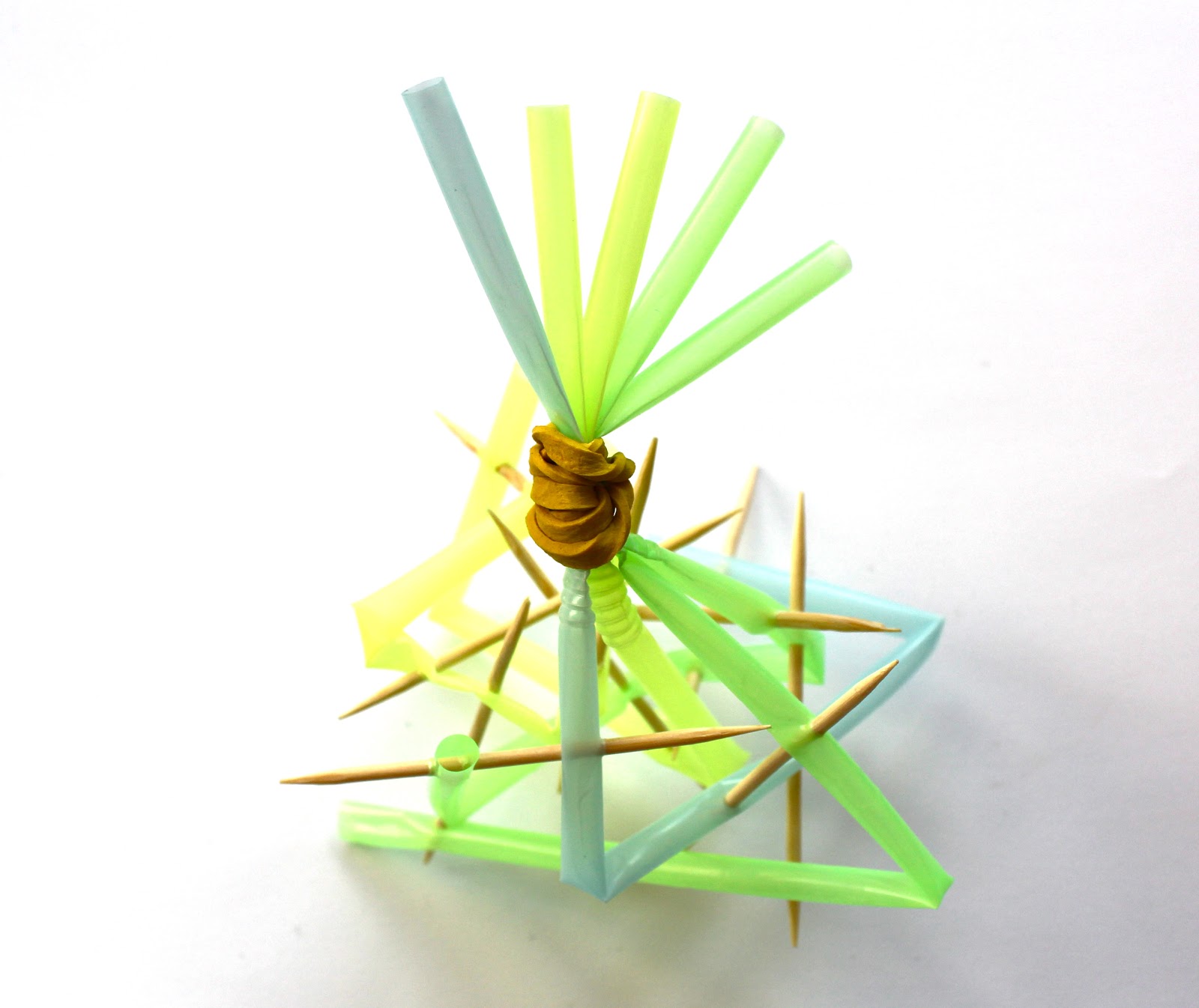
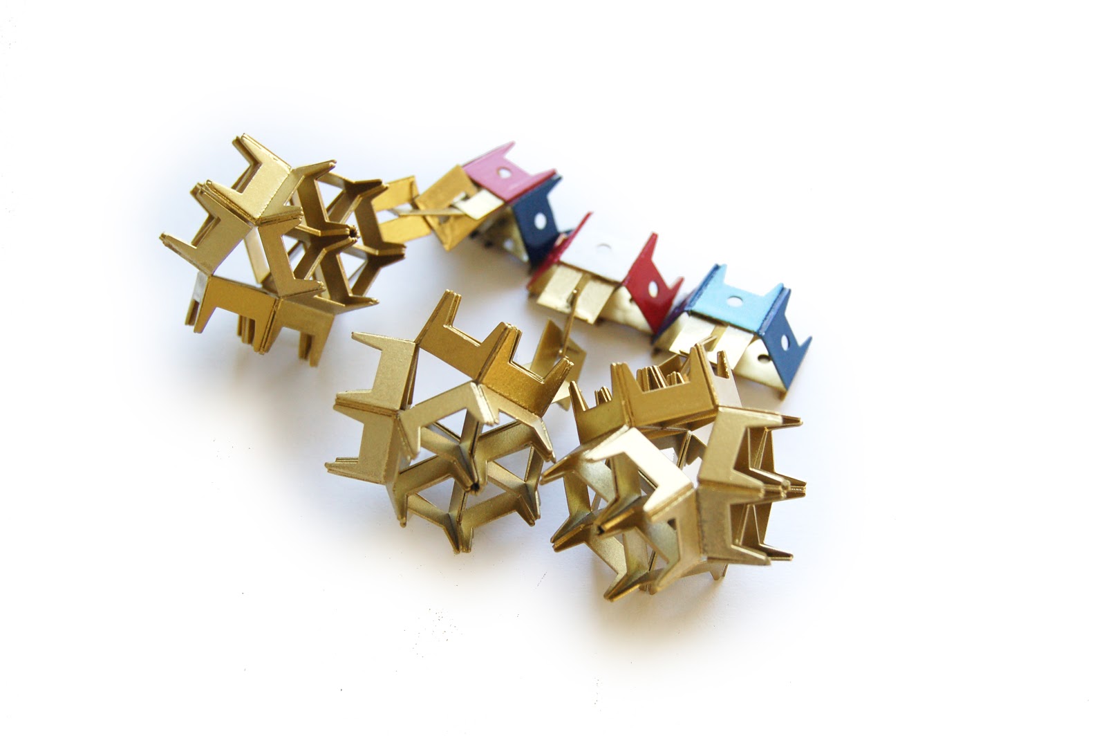
Each of us then received a bag of scrap metal and were challenged to design and create a piece of jewellery, both intricate and innovative, which would also embody our personal reflection on one of the two themes: ‘From Pens to Particle Physics’ and ‘Birmingham- A City in the Making'.

The scrap metals were divided into four categories ( aluminium, silver-plated brass, copper, stainless steel), and we were each limited to use our one given type of components as the only material. Though limited in material choice, we did not find it restricting and during the four week project, used the materials in the most unexpeted ways to come up with highly individual responses to the brief.

The design sheets as well as the finished pieces reflected the multitude of our styles and approaches; using a variety of techniques, some of us treated the metal gently, some of us aged it or "destroyed" it, all composed brand new and visually exciting pieces with a considered concept behind each of them.

At the end of May, they were judged by John Berkeley and wife Michele, who decided on five main winners in each category: Sanna Heino and Peter Clark (joint winners, aluminium), Harriet Knight (copper), Natalie Lee (brass) and Bow Sangthong (stainless steel).


Sanna Heino


Peter Clark


Harriet Knight


Natalie Lee


Bow Sangthong

Photos by Sally Collins


Credit was also given to the runners-up: Hayley Beckley, Amy Buzzard, Wai Yan Kevin Chan, Zhi Lu (Lulu) Cheng, Annaliese Foster, Chloe Hill, Youdi Lou, Man (Isabella) Liu, Francesca Onumah, Jason Sher, Jess Taylor, Abbie Williams, Jun Xie.

Hayley Beckley
Amy Buzzard


Wai Yan (Kevin) Chan


Zhi Lu (Lulu) Cheng


Annaliese Foster
 

Chloe Hill


Youdi Lou


Man (Isabella) Liu


Francesca Onumah


Jason Sher


Jess Taylor


Abbie Williams
 
Jun Xie

Photos by Sally Collins


Their pieces were granted a place in a public exhibition at the Birmingham Museum and Art Gallery - a well deserved but still rare pleasure for the (then) first year students!

Equally rewarding were the words of John Berkeley, who said:

" Brandauer (...) won medals at many of the great international exhibitions of the Victorian age for the design and craftsmanship of its pens. How appropriate that, 150 years later, we should be helping to stimulate a new generation of craftsmen and women to create award-winning designs in metal. Many of the creations are quite stunning and the city can be very proud that it attracts so many talented young people to its world-class School of Jewellery.

The exhibition was launched on 11th October, marking the opening of the museum's anticipated History Galleries. The winners and the runners up together with the course director, Zoe Robertson, and our tutor, Sally Collins, were invited to attend a private view that evening. 


Photos by: Sanna and Minna Heino, Jason Sher

Zoe commented:

"This grand opening of the museums highly anticipated History Galleries is such a prestigious evening, it’s so exciting to celebrate our student’s achievement in such a beautiful setting. I feel extremely proud of them and all involved in the project...”
All we can say in return is thank you to all who gave us such a great opportunity and that this is only a beginning of the good things to come!

The exhibition is now open to everyone and will run until Sunday 27th January 2013.

Sunday, October 14, 2012

BRAND - new beginnings...


We are students.                                                                                Multicultural.
We are jewellers.                                                                                Multi-skilled.
We are designers.                                                                               Multi-styled.

Over a year ago, we came from all corners of the world to study at the famous Birmingham School of Jewellery and formed a friendship that now inspired us to create our own company - BRAND-new design.

We are currently working hard on our individual collections, which will then form the very first BRAND limited edition collection, to be launched on 20th November 2012 at The Vaults, located in Birmingham's Jewellery Quarter.